Features
Styling
While iOS has very limited ways to customize the look and feel of the native keyboard, KeyboardKit can be styled and customized to great extent, using styles and themes.
KeyboardKit has a KeyboardStyle namespace that contains style-related types and views, as well as a KeyboardStyleService that can provide dynamic styles for different parts of a keyboard.
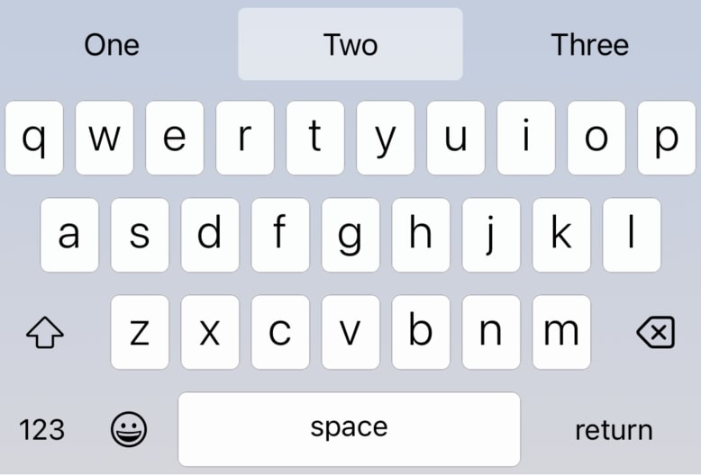
Colors & Images
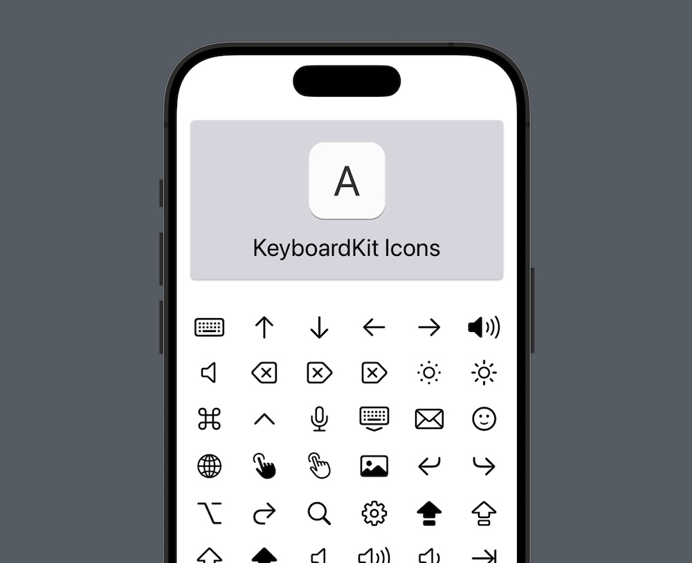
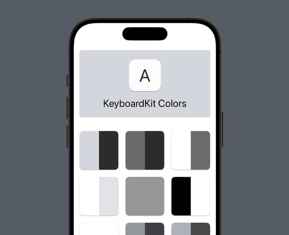
KeyboardKit defines keyboard-specific Color and Image assets that can be used in any keyboard.
See the docs for info on how semi-transparent colors are used to work around a system bug in iOS.
Type Extensions
Many KeyboardKit types define standard images, texts & colors. For instance:
let context = KeyboardContext()
let image = KeyboardAction.command.standardButtonImage(for: context) // Command icon
let text = KeyboardAction.space.standardButtonText(for: context)     // KKL10n.space
Style Modifiers
Most KeyboardKit views have custom styles and style modifiers. For instance, the Keyboard.Button view has a Keyboard.ButtonStyle that can be applied with the .keyboardButtonStyle(_:) modifier.
👑 KeyboardKit Pro
KeyboardKit Pro unlocks additional image assets, and a KeyboardTheme engine that makes easier to style keyboards with themes.
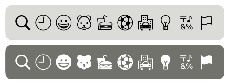
Emoji Icons
KeyboardKit Pro emoji-specific, vectorized assets, like the .keyboardEmoji and .emojiCategory(_:):
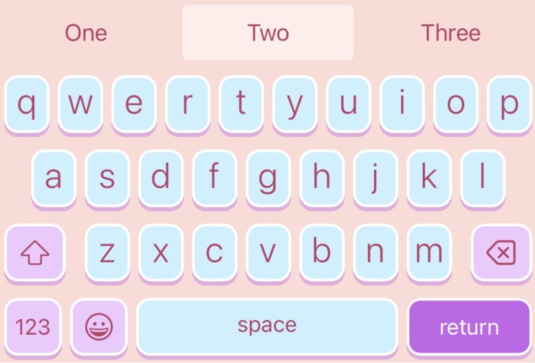
Themes
KeyboardKit Pro unlocks a KeyboardTheme engine that makes easier to style keyboards with themes:
See themes for more information about the KeyboardKit Pro theme engine and its various themes.
Documentation
The information on this page is shortened to be easier to overview. For more information, see the online documentation, or the KeyboardKit Pro documentation.
Features
KeyboardKit is packed with features. You can upgrade to KeyboardKit Pro to unlock pro features.
Essentials
KeyboardKit provides essential models, features & views.
Keyboard View
KeyboardKit can render a native-looking, customizable keyboard.
Actions
KeyboardKit lets you trigger and handle keyboard actions.
AI Support
KeyboardKit Pro unlocks features that are needed for AI.
App Utilities
KeyboardKit makes it easy to set up your app and its keyboard.
Autocomplete
KeyboardKit Pro unlocks local & remote autocomplete features.
Callouts
KeyboardKit can show input and secondary action callouts.
Device Utilities
KeyboardKit can identify device types, capabilities, etc.
Dictation
KeyboardKit Pro can trigger dictation from the keyboard.
Emojis
KeyboardKit defines emojis, Pro unlocks an emoji keyboard, etc.
Escrow
KeyboardKit Pro offers escrow services to enterprise customers.
External Keyboards
KeyboardKit Pro can detect if an external keyboard is connected.
Feedback
KeyboardKit can trigger audio & haptic feedback.
Gestures
KeyboardKit can trigger & handle rich keyboard gestures.
Host
KeyboardKit Pro can identify and open specific host applications.
Layout
KeyboardKit has fully dynamic & customizable layout engine.
Localization
KeyboardKit supports 72 locales, with localized resources.
Navigation
KeyboardKit lets you open urls and apps from the keyboard.
Previews
KeyboardKit has built-in support for SwiftUI previews.
Proxy Utilities
KeyboardKit can access the full document content in more ways.
Settings
KeyboardKit has tools for in-app settings & System Settings.
Status
KeyboardKit detects if a keyboard is enabled, has full access, etc.
Text Input
KeyboardKit Pro unlocks tools to let you type within the keyboard
Styling
KeyboardKit lets you style your keyboards to great extent.
Themes
KeyboardKit Pro unlocks a theme engine & many standard themes.